Blanks to Zeroes in a Power BI Matrix
Hi there!
Today we’re looking at Power BI visuals and how to make Blank values show as Zero values. We will find this simple for most visuals, but the Matrix visual is a different beast and will require more of an in-depth look, both at the visual itself and across your dataset. Let’s have a look how it’s normally achieved:
Blanks to Zeroes in Most Visuals (except Matrix)
To achieve this in other visuals is fairly simple, as shown in the following video:
As illustrated, the most simple way is to create a measure that is a numerical value, then use + 0 afterwards to ensure that the value is always numeric. In cases where the field was originally BLANK, this now shows as 0:
Here’s an example:

As you can see, for December, the measure is usually BLANK, but because we’ve added the + 0, this now shows as 0 as we were hoping.
So this should work for a Matrix, right?
Well, actually, no.
See, if we look at the following matrix, we have no entry under Returns at all. No zero, no nothing:

This is because the Matrix visualisation works in a different way.
So, what’s the problem?
Let’s have a look at the SQLBI website on Filter Context, specifically the part about SUMMARIZECOLUMNS. A Matrix Visual is a visual representation of this function:
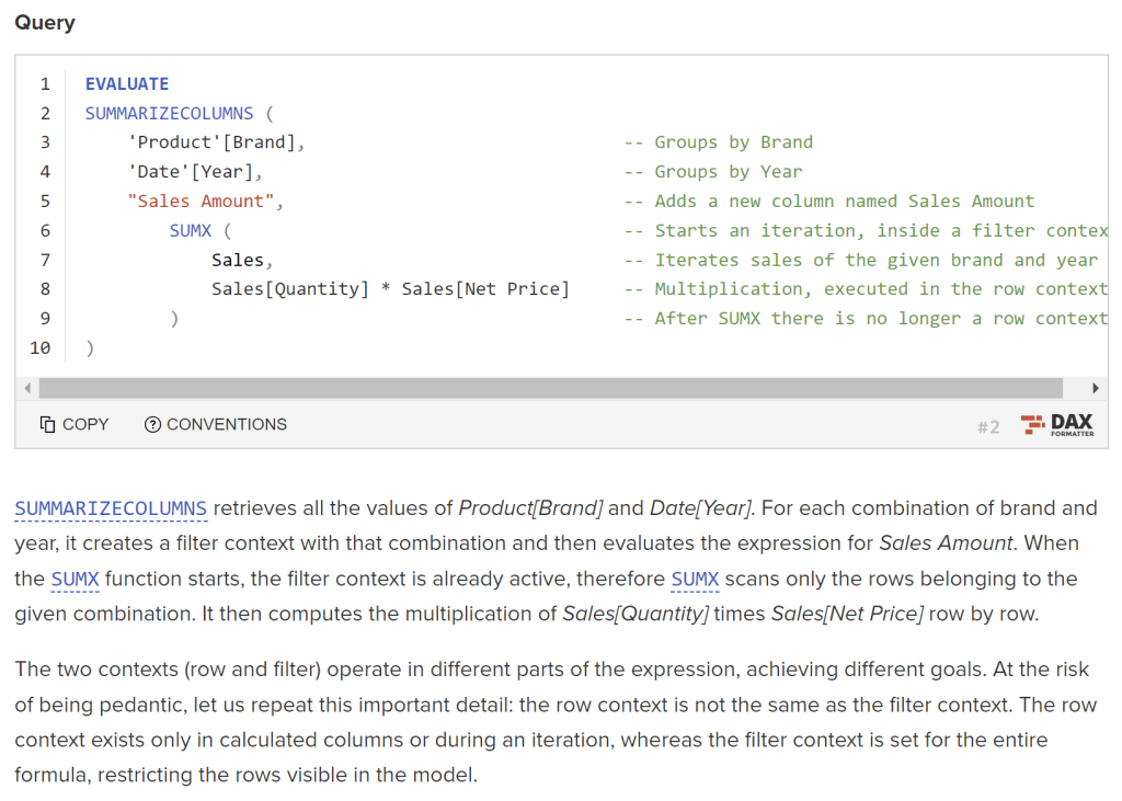
From the first paragraph, we see an important distinction:
“For each combination of brand and year, it creates a filter context with that combination and then evaluates the expression”
In other words, if you’re using a single flat file in Power BI with no rows for a given combination (e.g. Brand and Year), that combination is not evaluated, as it does not exist. Therefore, there’s no BLANK, no Zero, no nothing. This in turn means that there’s nothing to add a zero to and so the cell in the matrix stays blank.
What’s the solution?
To put it bluntly, the solution is to use dimension modelling.
If we have a Brand dimension and a Date dimension that our flat file joins to, a combination will exist, even if there’s no rows for it in the flat file. This will then be evaluated and a zero will be inserted.
To create a dimension from your flat file, simply create a new table with the distinct values in the flat file. For the Brand/Date example, you can do the following to create a Product Brand table from your Sales flat file:
Product Brand = DISTINCT(Sales[Brand])
Then do the same for the date. Date isn’t a great example as best practice dictates that a separate Date dimension be in place regardless, but the process is the same.
Finally, use these Dimension columns in the Matrix rather than the columns in the flat file and you should see the results instantly!
Final Thoughts
The Matrix visual works differently to all others in Power BI and in some ways is confusing. However, in some ways, it forces us to use best practices (i.e. dimensional modelling) and our dashboards will be better off for it.
That’s all for today – happy dashboarding!

Leave a comment