
Edward Tufte, a pioneering figure in the realm of data visualisation, is renowned for his advocacy of simplicity in presenting complex information. His vision transcends traditional boundaries, emphasising clarity, precision, and elegance in visualizations across diverse data types. Let’s delve into Tufte’s influential ideas on simplicity and their application in various visualisation formats.
Line Charts
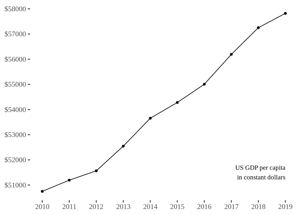
Tufte extolled the virtues of line charts for their simplicity in displaying trends over time. His emphasis on minimalism advocates for decluttering unnecessary elements, ensuring that the focus remains on the data. By removing excessive gridlines and employing subtle, clear markers, line charts communicate patterns effectively.
According to Tufte, the most useful aspects of line charts include:
- Clarity in displaying trends: Line charts are excellent for showcasing trends over time or across a continuous variable. They can effectively illustrate patterns, fluctuations, and correlations in data.
- Simplicity: When designed properly, line charts can present complex data in a simple and understandable format, making them accessible to a wide audience.
- Highlighting relationships: They are valuable for displaying relationships between variables and for comparing multiple sets of data simultaneously.
- Highlighting outliers or anomalies: Line charts can often make outliers or irregularities in the data more apparent, aiding in identifying anomalies or unusual patterns.
However, there are aspects that Tufte might consider less useful or even problematic in line charts:
- Overcomplication: Overloading a line chart with too much information, such as numerous lines or excessive data points, can clutter the visualization and make it harder to interpret.
- Misleading scaling or labelling: Inaccurate scaling, inappropriate axes, or misleading labelling can distort the interpretation of the data represented in the line chart.
- Missing context: Line charts may not always provide enough context or explanation, leading to potential misinterpretations or incomplete understandings of the data being presented.
Bar Charts
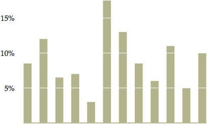
In Tufte’s world, bar charts shine as great examples of simplicity. He emphasises the importance of using the appropriate scale and avoiding unnecessary embellishments, allowing viewers to quickly grasp comparative data without distractions.
Here are the aspects of bar charts that Tufte might consider useful:
- Comparison of discrete categories: Bar charts excel at visually comparing discrete categories or groups of data. They make it easy to compare values among different categories or items.
- Clarity and simplicity: Well-designed bar charts can present information in a straightforward and easily understandable manner, making them accessible to a wide audience.
- Emphasis on differences: Bar charts highlight differences between categories or items, aiding in identifying variations and patterns in the data.
- Efficient communication: They can efficiently communicate large amounts of data without overwhelming the audience, especially when dealing with a limited number of categories.
On the flip side, aspects of bar charts that Tufte might consider less useful or problematic include:
- Misleading representation: Similar to other visualizations, bar charts can be misleading if the scaling, labeling, or presentation of data is not accurate or appropriate.
- Overuse or misuse: Using bar charts for data that might be better represented by other types of graphs or when the data does not suit a categorical comparison can limit the effectiveness of the visualization.
- Oversimplification: While simplicity can be an advantage, oversimplifying the data or omitting crucial information in a bar chart may lead to a lack of context or incomplete understanding.
Scatter Plots
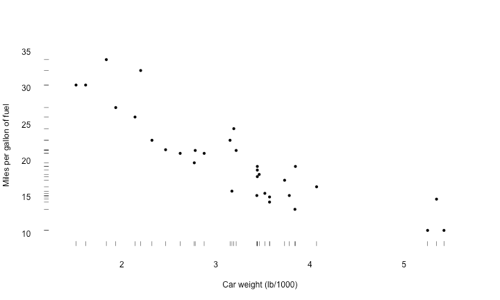
Tufte’s approach to scatter plots emphasises the power of displaying relationships between variables without unnecessary clutter. He advocates for unobtrusive markers, clear labels, and minimal chart junk, enabling viewers to discern patterns effortlessly.
Here are the aspects he might find useful about scatter plots:
- Displaying relationships: Scatter plots are excellent for showcasing the relationship between two continuous variables, helping to identify correlations, clusters, trends, or patterns in the data.
- Identifying outliers: They can easily highlight outliers or anomalies in the data, making it easier to detect unusual observations or data points.
- Visualising distributions: Scatter plots provide a visual representation of the distribution of data points, revealing the density or dispersion of the dataset.
- Flexibility and versatility: They can accommodate a wide range of data types and are versatile in displaying complex relationships or multivariate data using additional plot elements like colour, size, or shape.
However, there are aspects of scatter plots that Tufte might consider less useful or problematic:
- Over-plotting: When dealing with a large number of data points, scatter plots can suffer from over-plotting, where points overlap, making it difficult to discern individual data points or patterns.
- Insufficient context: Without proper labels, scales, or additional context, scatter plots may not convey enough information to make accurate interpretations, leading to misunderstandings.
- Misleading visual cues: Improper scaling, inadequate axis labels, or misleading visual cues can distort the representation of relationships between variables.
Small Multiples
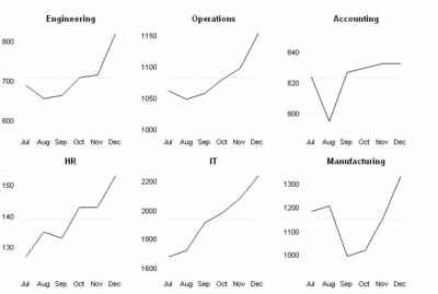
Tufte challenged the status quo by advocating for data-dense designs that present a wealth of information in a small space without compromising clarity. His concept of “small multiples” involves displaying multiple similar graphics side-by-side, enabling efficient comparison and analysis.
Here are the aspects he might consider useful:
- Comparison of multiple datasets: Small multiples allow for easy comparison between multiple sets of data, patterns, or trends across different categories or variables.
- Clear presentation: Each small graphic within the multiples is often simple and focused, making it easier for the audience to comprehend and compare the information presented.
- Facilitating pattern recognition: By arranging similar graphics in a grid or sequence, small multiples help viewers detect patterns, anomalies, or changes across categories or time periods.
- Reducing clutter: Breaking down complex data into smaller, digestible visual elements prevents overwhelming the audience with information overload.
However, there are aspects of small multiples that Tufte might consider less useful or problematic:
- Consistency and labelling: Inconsistencies in scaling, labelling, or design across the small multiples can hinder accurate comparisons or mislead the audience.
- Space limitations: With a large number of small graphics, the available space might limit the amount of information that can be effectively displayed within each unit.
- Complexity in interpretation: If not designed thoughtfully, small multiples could become difficult to interpret, especially if there’s a lack of coherence or if they require extensive explanation.
Conclusion
Edward Tufte’s enduring legacy lies in his advocacy for simplicity, clarity, and the efficient communication of information through visual means. His principles, emphasising minimalism, decluttering, and the elimination of unnecessary embellishments, continue to influence and inspire practitioners in the field of data visualisation.
By embracing Tufte’s vision for simplicity, we can craft visualisations that transcend mere data representation to become insightful, engaging narratives.

Leave a comment