
Introduction
In our contemporary data landscape, dashboards have emerged as pivotal instruments in guiding decision-making across many sectors. These visual representations of data offer profound insights capable of shaping strategies, fostering innovation, and streamlining operations. However, the presumption of data objectivity often masks the biases ingrained within these dashboards, potentially distorting our perceptions and influencing decisions. Today, we discuss how these biases can happen and how they can be avoided.
Hidden Biases

The appeal of dashboards lies in their capability to show complex data as easily readable visuals. They present a snapshot of performance metrics, trends, and patterns, providing a clear overview on massive datasets. Yet, beneath these polished graphs and charts lie concealed biases, both deliberate and inadvertent, that significantly impact the narrative they convey. Let’s see a few examples.
Cherry-Picking Data and Shaping Narratives

A prevalent pitfall involves cherry-picking data to align with preconceived narratives. It is natural for individuals or organisations to harbour specific objectives. In pursuit of these goals, there exists a temptation to selectively display data that bolsters a particular viewpoint while omitting contradictory or unfavourable information. This selective showcasing can portray an incomplete or deceptive picture, prompting decisions based on partial truths rather than comprehensive realities.
Let’s consider a dashboard that has been created to show the results of a marketing campaign – a dashboard that has been developed by that same team. How do you think the data would be represented? Would that team be eager to show that the campaign was not a success? Or would they (consciously or otherwise) massage the results to make themselves look better to the company?

Further, the design and presentation of dashboards can inadvertently introduce biases. Choices concerning which metrics to display, how they are visualised, and the scale used can influence interpretations. For instance, opting for a specific timeframe for data analysis or selecting particular variables might amplify specific trends while understating others, skewing audience perceptions.
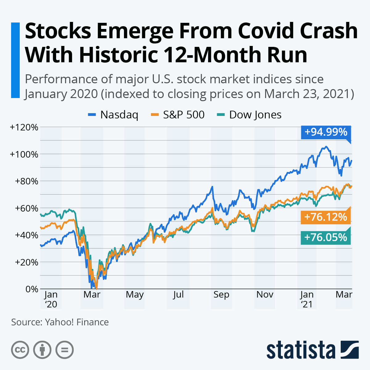
One of the stranger consequences of COVID-19 has been its ability to distort timeframes and performance of the economy. In the first half of 2020, vast swathes of stocks took a massive nosedive as the economy effectively ground to a halt, yet a few months later these stocks had shot back to the same levels.
 You will find more infographics at Statista
If you were in charge of making your company look good, you can think of the perfect way to achieve it. Create a timeline of your company’s share price starting in April 2020 and ending in September and, hey presto, it rose massively! Yet set the start of this timeline to January 2020 and you see a very different picture. There may not be any movement at all between the start and end of the period.
People are only human after all, we’re conditioned to make ourselves look better, as a result we must be very careful about how we achieve it.
Striking a Balance

Advocating for absolute neutrality in data representation poses challenges. While presenting data as entirely pure and letting the results speak seems ideal, acknowledging complete objectivity as unattainable is essential. Every stage of data collection, analysis, and visualisation involves human input, inherently carrying biases and perspectives.
Instead of pursuing absolute objectivity, a pragmatic approach involves transparency and bias awareness. Critically examining data collection methods, questioning the assumptions behind chosen metrics, and openly acknowledging potential biases within dashboards are critical steps. Encouraging diversity in perspectives during data interpretation can also mitigate these biases.
Data-Driven Scepticism
Fostering a data-driven culture that fosters skepticism and critical thinking is vital. Rather than unquestioningly embracing dashboard insights, organisations should encourage an environment where individuals actively challenge presented data, seek alternative viewpoints, and consider broader contexts before drawing conclusions.

Conclusion
In conclusion, while dashboards serve as invaluable tools for data-driven decision-making, they are not immune to biases. Acknowledging and addressing these biases is imperative to ensure data-driven insights are as accurate and unbiased as possible. Balancing transparency and acknowledging inherent biases with the goal of presenting clear and actionable insights is key to leveraging the true power of data analytics.
Behind every dashboard lies a narrative, and understanding the biases within that narrative is crucial to discerning the complete story hidden within the data.
After all, we are only human – sometimes, we need to remember that.

Leave a comment